All in the Same Boat: A Look at States’ Unemployment Rates
Macro Minute
February 10, 2026
The national unemployment rate ended 2025 at 4.4 percent, up 30 basis points from its year-ago reading, 60 basis points compared to its level two years ago, and 90 basis points compared to three years ago. This extended rise has led to increased concern that the labor market may be heading toward a period of softness or even a full recession. But aggregate national data obscure differences in economic conditions across geographies. In this post, we look at states' unemployment rates to explore the extent to which the slowing in the labor market has been common across states.
In Figure 1 below, I use box-and-whisker plots to depict the distribution of annual unemployment rates (the annual average of monthly unemployment rates) in all states plus the District of Columbia. Each box corresponds to a year, going from the earliest year (1976) on the left to the most recent year (2025) on the right. The top line of each box corresponds to the third quartile of the statewide distribution of unemployment rates, while the bottom line of the box corresponds to the first quartile. The horizontal line in the middle of each box represents the median of the distribution, while the "X" in each box represents the mean. Extending from the ends of the boxes are "whiskers" which span the highest and lowest unemployment rates that are within 1.5 times the interquartile range of states' unemployment rates. Observations beyond this range are considered to be outliers and are depicted using dots.
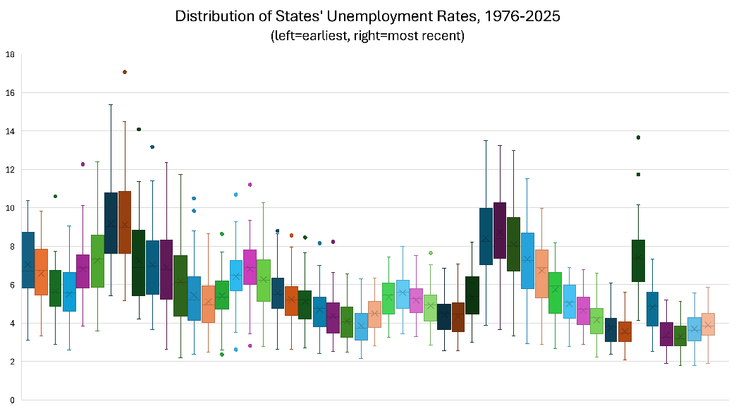
Figure 1 shows that, while the average unemployment rate across states has risen since 2023, the distribution of state unemployment rates in 2025 is not particularly wide compared to the dispersion observed in prior years. State unemployment rates appear to have more variation (including more outliers) in the earlier half of the sample compared to the latter half of the sample. Figure 1 also shows that the dispersion of state unemployment rates increases during recessions such as the Great Recession of 2007-2009 and the 2020 COVID-19 recession.
Another way to see that the state unemployment rate distribution widens during recessions is to plot measures of statistical dispersion directly. The range is the difference between the maximum and the minimum unemployment rate across all states and D.C., while the interquartile range (IQR) is the difference between the first and third quartiles of states' unemployment rates. As seen in Figure 2 below, both measures tend to rise during recessions, although not always. Currently, both the range and the IQR are on the low end of their respective historic values.
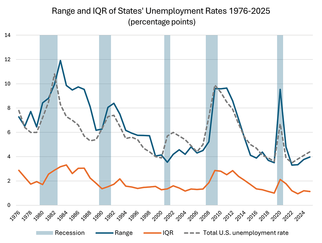
Like the unemployment rate, dispersion — at least as measured by the range — has been rising since 2022, suggesting some states may be bearing the brunt of a softening labor market more than others. However, both measures remain at historically low levels. It remains an open question whether the recent trajectory of these indicators translates into labor market weakness.
Views expressed in this article are those of the author and not necessarily those of the Federal Reserve Bank of Richmond or the Federal Reserve System.
Contact Us