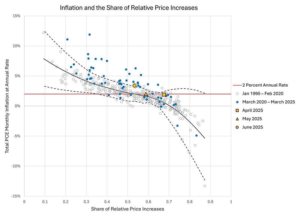
Scatterplot of Inflation and the Share of Relative Price Increases
Monthly inflation fluctuates even in the most successful inflation-targeting regime, and we rely on a range of indicators to infer whether monthly inflation is deviating fundamentally from the FOMC's two percent target. The scatterplot of inflation and the share of relative price increases provides one such indicator, because prior to the pandemic — when inflation was generally stable — there was a systematic relationship between inflation and the share of relative price increases. In months when inflation was high, the share of relative price increases was typically low: there were large price increases for items accounting for a small share of expenditures. The inverse was true in months with low inflation.
The Scatterplot of Inflation and the Share of Relative Price Increases indicator was initially developed by economists Andreas Hornstein and Alex Wolman of the Richmond Fed. It has subsequently been expanded in the work cited below in collaboration with Francisco Ruge Murcia of McGill University and Simon Smith of the Federal Reserve Board.
Latest Reading
Last updated on
PCE inflation in February was 4.6% at an annual rate. The share of relative price increases was 0.25. The inflation rate for February was close to its predicted value conditional on the share of relative price increases and the pre-COVID relationship.
How Should I Interpret the Scatterplot of Inflation with the Share of Relative Price Increases?
The scatterplot of monthly inflation and the share of relative price increases provides a simple benchmark for assessing whether monthly inflation is behaving in a manner consistent with the 25 years before the pandemic.
The black solid line in the figure is the predicted inflation rate conditional on the share of relative price increases, estimated by local polynomial regression, using data from January 1995 through February 2020. The dashed lines represent a two-standard-deviation prediction interval. We interpret monthly readings within this interval as suggesting that inflation is behaving as it did prior to the pandemic, in a manner broadly consistent with — or slightly below — the Fed's 2 percent target.
Additional Resources
Hornstein, Andreas, Francisco Ruge-Murcia, and Alexander L. Wolman. "The Relationship Between Inflation and the Distribution of Relative Price Changes." Federal Reserve Bank of Richmond Working Paper No. 24-15, December 2024.
Smith, Simon C., and Alexander L. Wolman. "New Tools to Monitor Inflation in Real Time." Federal Reserve Board of Governors FEDS Notes, Dec. 20, 2024.
Wolman, Alexander L. "Detecting Inflation Instability." Federal Reserve Bank of Richmond Economic Brief No. 23-11, April 2023.
Wolman, Alexander L. "Inflation and Relative Price Changes Since the Onset of the Pandemic." Federal Reserve Bank of Richmond Economic Brief No. 24-09, March 2024.
Wolman, Alexander L. and Francisco Ruge-Murcia. "A Model-Based Perspective on Inflation and the Distribution of Relative Price Changes." Federal Reserve Bank of Richmond Economic Brief No. 24-30, September 2024.
Suggested Citation
Scatterplot of Inflation and the Share of Relative Price Increases, Federal Reserve Bank of Richmond, last modified April 10, 2026, https://www.richmondfed.com/research/national_economy/inflation_share_of_relative_price_increases


