

Visualizing the Low-Hire, Low-Fire Labor Market
Macro Minute
September 22, 2026
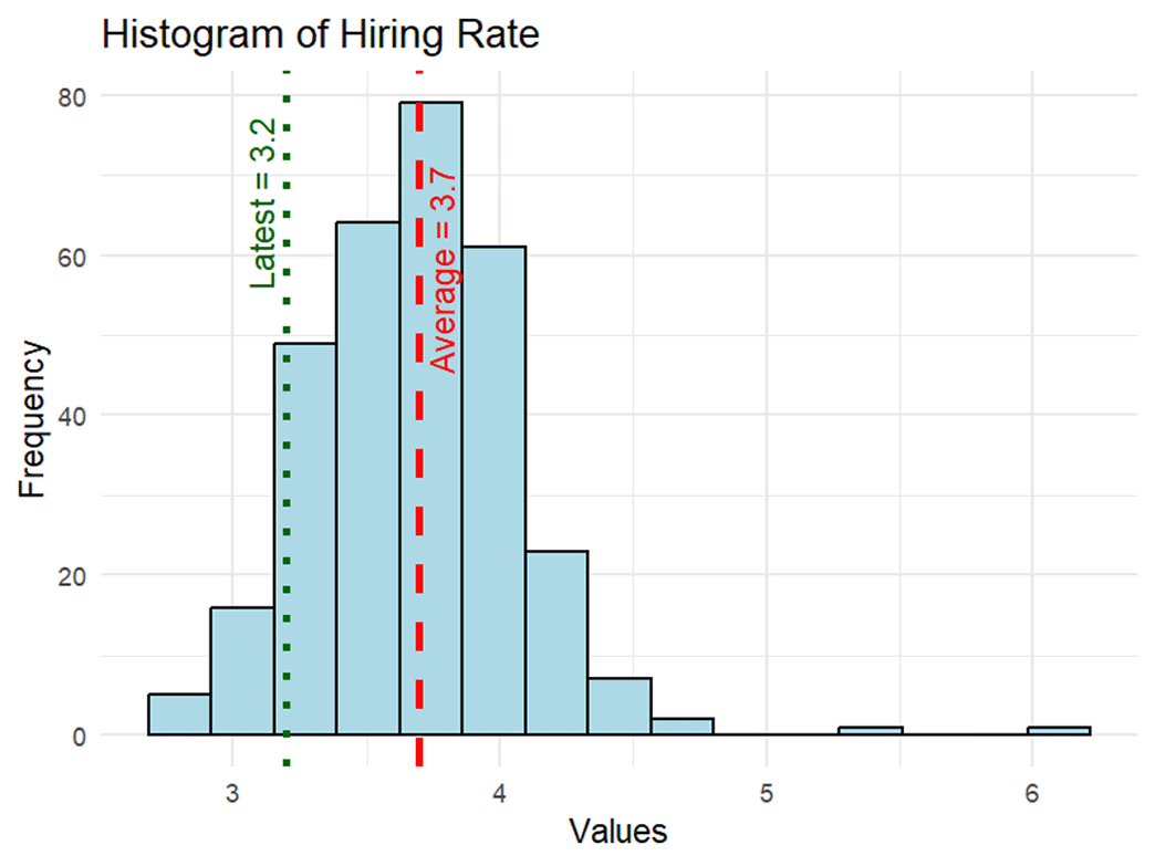
How unusual is the current combination of slow job creation and low layoffs — namely, the "low-hire, low-fire" labor market — observed in today's data? Figure 1 shows a histogram of historical hiring rates published in the Job Openings and Labor Turnover Survey (JOLTS). The July hiring rate of 3.2 percent was indeed below average but not unprecedented, as 7 percent of observed hiring rates since December 2000 have been below this mark.
Similarly, the July layoff rate of 1.0 percent is below its long-run average but not historically unprecedented. Figure 2 shows that only 4 percent of observed layoff rates since December 2000 have been lower. Also, the distribution of layoff rates is much more compressed compared to the distribution of hiring rates. It features a long right tail driven by the presence of the high outliers observed during the COVID pandemic: a layoff rate of 8.5 percent in March 2020 and 6.9 percent in April 2020.
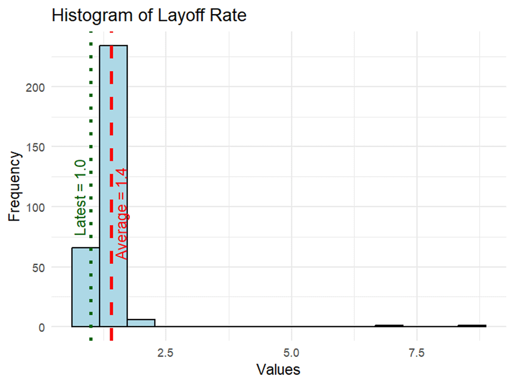
By looking at labor market indicators only in isolation, Figures 1 and 2 understate how peculiar the low-hire, low-fire constellation of labor market indicators is historically. To better visualize this phenomenon, we group 12 labor market indicators into two categories:
- The hiring channel collects eight measures of how easily workers are being absorbed into jobs: the probability that an unemployed worker finds employment within a month; the ratio of new hires to overall employment; job openings; the share of employed workers that quit; unemployed job leavers as a share of the labor force; and one-month changes in payrolls, temporary help employment and the employment-to-population ratio.
- The separation channel collects four measures of how frequently workers are separated from jobs: job losers as a share of the labor force, initial claims for unemployment insurance, the layoffs and discharges rate as a share of overall employment, and the probability that an employed worker becomes unemployed.
Each indicator is converted to a percentile within its own history since 2000 using three-month averages and is oriented so that higher (going further upwards or to the right) always means a tighter labor market (that is, easier hiring or fewer separations). Averaging within each channel gives every month since 2000 a position on a two-dimensional map. Figure 3 shows that map, with each dot representing one month of data.
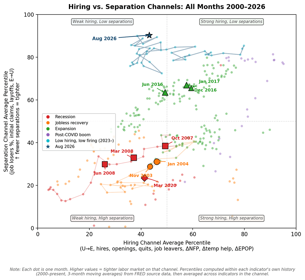
Recessionary months (with weak hiring and high separations) cluster in the lower left corner, while expansion months (with strong hiring and low separations) sit in the upper right corner. The months since 2023 trace out a path toward the top left quadrant of the plot, sitting above all the other points in the map. This top-left quadrant captures both weak hiring and low separations, indicating a "low-hire, low-fire" labor market.
The navy star denotes the latest data available at the time this post was written, and it sits at the 43rd percentile on the hiring channel and the 90th percentile on the separation channel. In other words, getting hired is slightly harder compared to other months since 2000, while the frequency of being separated is close to the lowest on record. The map shows just how far the current data sit from data observed over the past 26 years.
Historical comparisons may help put today's data in perspective. In October 2007, two months before the Great Recession began, the hiring channel stood near the 49th percentile, which is not far from today's reading. But the separation channel stood near the 38th percentile, meaning that layoffs and claims were already elevated and rising. In contrast, separations today are not rising. In facts, they are lower than many expansion periods (for instance, mid-2016).
In short, on the firing side, nothing in the current data resembles a prerecession pattern. Hiring, on the other hand, looks somewhat lackluster but has not deteriorated further: The hiring channel has now spent more than two years below the 50th percentile.
A recovery in the hiring channel would move it rightward in the map. August offered a small step in this direction: The hiring channel rose from the 36th percentile in July to the 43rd, and we will watch any further development as the data comes out.
Views expressed in this article are those of the author and not necessarily those of the Federal Reserve Bank of Richmond or the Federal Reserve System.


Contact Us