Income Inequality Across the Fifth District
Regional Matters
September 30, 2016
Income Growth and Income Inequality in the Nation
Slow income growth and rising income inequality have become the focus of much attention since the recession ended in mid-2009. Perhaps this is because employment growth in the nation has been pretty healthy, growing 1.6 percent annually from 2010 to 2015, while real wages grew by only half that pace over the same time period, contributing to a sense of losing ground for many households. In addition, the steep rise in income among the top (richest) 1 percent of households has also sharpened the focus on income inequality.
A June 2016 report from the Congressional Budget Office noted income growth of 192 percent for the top 1 percent of earners from 1979 to 2013. Recent data indicate that the tide might be turning — the U.S. Census Bureau reported earlier this month that real median household income grew 5.2 percent from 2014 to 2015, the first annual increase in this measure since 2007. Even with this progress, real median household income in 2015 remained 1.6 percent lower than it was in 2007.
The same report suggested that income inequality did not change much from 2014 to 2015. The standard measure of income inequality is the Gini index (sometimes called the Gini coefficient). The Gini index summarizes the entire distribution of income in a single metric ranging from zero to one. A Gini index of zero would result if income were distributed equally across all groups, while a value of one indicates that all of the income is received by the highest-income group, with none going to the lower-income groups. This metric can be used to compare a single region over time or to compare geographic units such as states or countries. The U.S. Gini index has been on the rise: In 1979, the U.S. Gini index was 0.404, but by 2015, it had risen to 0.479 (see chart below).
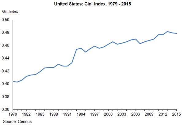
Another way to determine how the distribution of income is changing is to examine directly the shares of income going to equally sized groups of households. Typically, the data are reported for quintiles of households, where households are ranked from lowest to highest household income. The lower quintile represents the poorest 20 percent of households, while the highest quintile represents the richest 20 percent of households. In 2015, the highest quintile accounted for 51.1 percent of household income, while the lowest quintile's share was just 3.1 percent.
Comparing Income Inequality in the Fifth District
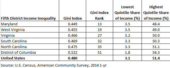
When it comes to measures of income inequality, the states in the Fifth District vary widely. Using the Gini index as a measure of income inequality, the table below shows that Maryland had the least inequality in income, with a Gini index of 0.449, while the District of Columbia had the greatest income inequality, with an index of 0.522, based on Census data for 2014. All of the states in the Fifth District had a Gini index lower than the national 0.48 index, but the District of Columbia had greater inequality than any of the 50 states.
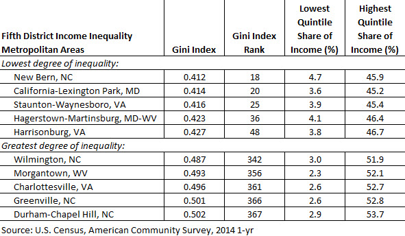
The Census provides a Gini index for 381 metropolitan areas in the United States, with 46 of those areas located within the Fifth District. Most of the metropolitan areas within the Fifth District had lower income inequality than the nation as a whole, and for many of the metropolitan areas with a higher Gini index, the value was not statistically different from the U.S. index. In fact, of the Fifth District metropolitan areas, only the Durham-Chapel Hill, N.C., metropolitan area had income inequality that was statistically more unequal than the nation. (See table below)
For many metropolitan areas, income inequality has increased in recent years, as it has in the nation. A recent Brookings Institution analysis of the change in income inequality from 2007 to 2014 in the country’s 100 largest metropolitan areas found that several Fifth District metropolitan areas experienced a statistically significant increase in inequality over this period as indicated by an increase in the 95/20 ratio (ratio of the 95th percentile to the lowest quintile). These included Charlotte, N.C., Raleigh, N.C., Washington, D.C., and Virginia Beach-Norfolk, Va. None of the Fifth District metro areas included in the Brookings analysis experienced a statistically significant decline in inequality.
Although income among U.S. and Fifth District households has grown in recent months, many households have not yet recovered from the recession. More importantly, the persistent rise in income inequality has caused many people to wonder about the prospects for the next generation. While the income distribution in any given year is a snapshot in time, measures of economic mobility capture the opportunity to move along the income ladder, either in one’s own life or across generations.
For more discussion of income inequality and economic mobility in the Fifth District, see the District Digest article in the latest issue of Econ Focus magazine.
Have a question or comment about this article? We'd love to hear from you!
Views expressed are those of the authors and do not necessarily reflect those of the Federal Reserve Bank of Richmond or the Federal Reserve System.
Contact Us