Economic Impact of COVID-19
Special Report
May 15, 2020
Uncertainty about the risk of contracting COVID-19 and strict lockdown measures induced workers and consumers to drastically change their work and consumption habits. Nonessential workers substituted working at the office with working at home. Consumers reduced the number of shopping trips, concentrating their shopping in fewer (larger) stores and increasing their online shopping. Although these patterns seem indisputable, the extent of the changes remains an open question.
One way to quantify the magnitude of these changes is to use mobility indexes. In particular, we use mobility indexes from anonymized cell phone data that track individuals through space and time. With the aim of generating research to understand the effect of the COVID-19 pandemic, companies that usually do not share such data, or that typically sell it, are currently making some or all of the data available. We use data produced by the Maryland Transportation Institute (MTI) at the University of Maryland.1 The data include information on the beginning and the endpoint of each trip taken by residents of a region, as well as the reason for the trip. The data are available at the county, city, state, and national levels and are presented at a daily frequency.
We use two different variables as indicators of mobility: first, the fraction of people staying at home, defined as no trips farther than a mile away from home; and second, the average number of miles traveled per person via all modes of transportation (walk, bike, car, train, bus, and plane, among others). We analyze the time period March 2 to April 27. We choose this time period because we want to focus strictly on the lockdown period.
Staying at Home
The left panel of Figure 1 shows the difference in the percent of people staying home across U.S. states between March 2 and April 27. The right panel presents the same differences across counties within the Richmond Fed's district (the Fifth District). Both plots show substantial spatial variation, potentially related to differences in population density and how easy it is to shop online and/or close to home. The highest increases in the percent of people staying at home at the state level occurred in New Jersey and New York, while the lowest increases occurred in North Dakota and South Dakota. Within the Fifth District, the highest increases in the fraction of people staying at home occurred in the counties surrounding major cities, particularly in Northern Virginia.
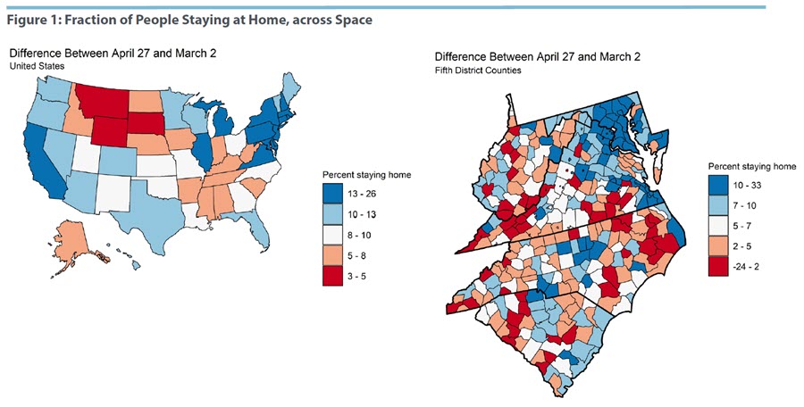
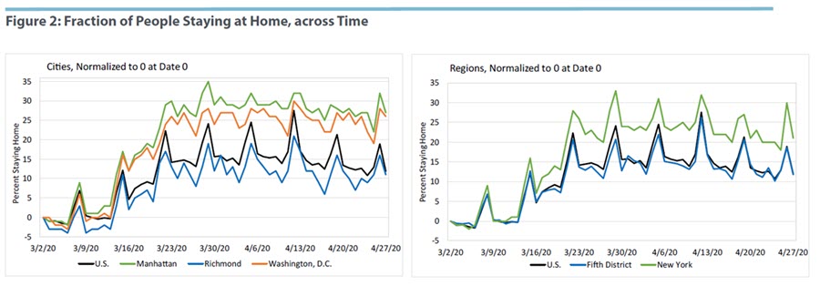
Figure 2 shows the time series of the fraction of people staying at home. The left panel presents it for Manhattan, Richmond, and Washington, D.C., and adds the U.S. time series for comparison. The right panel presents the time series for the Fifth District as whole, the state of New York, and the U.S. Overall, the figure reveals that: i) the fraction of people staying home increased sharply between March 10 and March 25 and stabilized thereafter; and ii) there are daily movements in the fraction of people staying home — in particular, more people stay home on the weekends. Also, the figure shows that the city of Richmond experienced a lower increase in the fraction of people staying home than Manhattan and Washington, D.C.
Why did Richmond experience a lower increase? It may be related to the city's lower population density. If the probability of infection increases with the frequency and length of close contacts among people, a location's population density should play an important role in explaining spatial differences. At the end of the memo we confirm the link between a location's population density and the decline in mobility observed in the location. The right panel of the figure shows the same pattern for the Fifth District as a whole when compared with New York state. Another interesting fact is that the Fifth District follows closely the time series for the U.S.
Miles Traveled
Figure 3 shows, for the period March 2 to April 27, the log difference in average miles traveled per person in each state in the U.S. (left panel) and each county in the Fifth District (right panel). This index is inversely related to the change in the fraction of residents staying home.
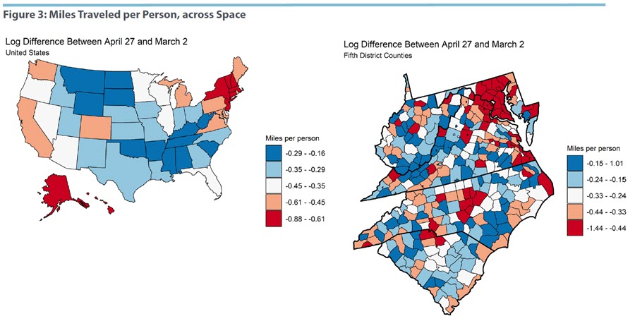
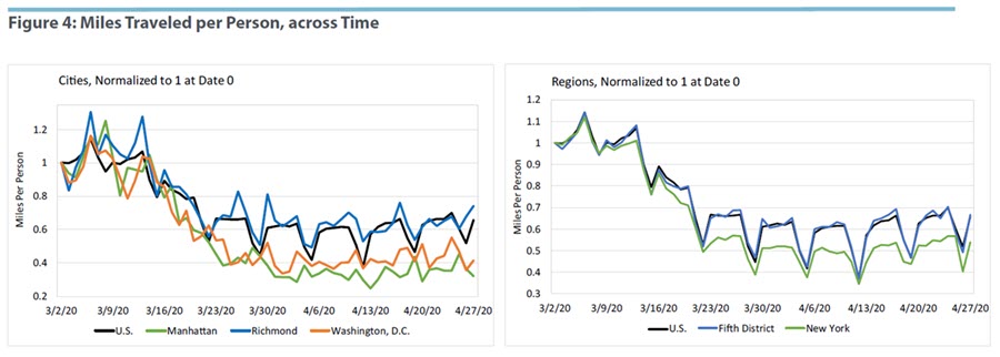
Figure 4 shows the time series for the log difference in miles traveled. While the average person in Richmond traveled 25 percent fewer miles on April 27 relative to March 2, the average person in New York City and Washington, D.C., traveled approximately 60 percent fewer miles on April 27 compared to March 2. A similar pattern is observed for the Fifth District as a whole.
Density and Miles Traveled
We suggested that regional differences in the decline in miles traveled might result from differences in population density across space. Here, we explicitly test the link between the population density of a location and the change in average miles traveled per person. Figure 5 presents a scatter plot with the log of population density of a location in the x-axis (states in the left panel and counties in the right panel) and the log difference in average miles traveled per person between March 2 and April 27 in the y-axis. As conjectured above, the figure confirms a strong connection between a location's population density and the decrease in miles traveled per person. In particular, according to the state-level analysis, a 100 percent increase in a state's population density decreases miles traveled by the average person in the state by 5.5 percent.
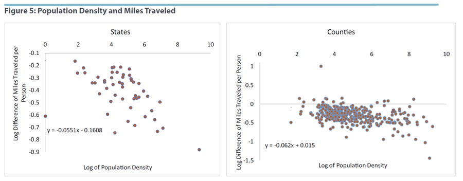
What explains this link? Locations with high population density have more establishments within an industry per square mile. This implies that residents of high population density locations can travel fewer miles in order to purchase the same bundle of goods than residents of low population density locations. In the presence of the possibility of COVID-19 infection, locations with more establishments per square mile allow their residents to reduce the risk of infection by purchasing goods in nearby locations. This results in a negative relationship between a location's population density and the decline in distance traveled by the location's residents. In other words, areas with high population density had larger declines in distance traveled.
If this is the case, why did we see more infections in New York City than in Richmond? Population density could also be playing a role: Walking a short distance to buy goods does not have a lower infection probability than walking a long distance if, during the short walk, the person bumps into a large amount of people relative to the long walk. Under this hypothesis, the fact that New York City has a higher incidence of COVID-19 in its population relative to Richmond implies that New York City actually experienced a smaller decrease, relative to its population density, in miles traveled per person than Richmond. Why didn't we observe an even larger adjustment in miles traveled in New York City that would make the infection probability equalized across locations? One compelling argument is that establishments require some minimum amount of space to operate, preventing establishments from being as close as required to their customers. Thus, reducing the infection rate in New York City, through further reducing the miles traveled by its residents, is bounded above by indivisibilities in establishments.
Marios Karabarbounis is an economist and Nicholas Trachter is a senior economist in the Research Department of the Federal Reserve Bank of Richmond
1
Maryland Transportation Institute, University of Maryland COVID-19 Impact Analysis Platform
This article may be photocopied or reprinted in its entirety. Please credit the authors, source, and the Federal Reserve Bank of Richmond and include the italicized statement below.
Views expressed in this article are those of the authors and not necessarily those of the Federal Reserve Bank of Richmond or the Federal Reserve System.