Recession Predictors: An Evaluation
Economic Brief
August 2022, No. 22-30
In the first half of 2022, real GDP has declined in each quarter, but the unemployment rate has remained at historically low levels. Since past recessions have been associated with a sharp increase of the unemployment rate, we are unlikely to be in a recession, but the consecutive GDP declines could suggest that a recession is imminent. This Economic Brief reviews the evidence on yield spreads, which past research has shown to be useful recession predictors. Current readings of these indicators do not yet suggest that the onset of a recession within the next year is very likely.
With inflation reaching levels not seen in decades, the Federal Open Market Committee has tightened policy in response, namely by rapidly increasing the federal funds target rate and winding down the Fed's balance sheet. While these moves are aimed at corralling inflation, there is some concern that this policy action might cause a recession.
In this article, I review indicators that have proven useful in predicting recessions. The baseline indicator that I examine is the interest rate spread of long-term government bonds over short-term government bonds, which is commonly referred to as the yield curve. As of now, this baseline indicator does not yet indicate an elevated risk of recession.
I also look at two alternative interest rate spreads over different maturities as well as a portmanteau index of leading indicators. I find that adding any one of these alternative indicators to the baseline interest rate spread does not improve forecast performance for recessions significantly.
Recession Indicators
For the baseline indicator, I use the spread of the 10-year Treasury bond rate over the three-month Treasury bill rate, which we'll call 10Y3M. This spread frequently shows up as a good indicator of future recessions in studies of comprehensive sets of recession indicators.1
One can view the spread as being composed of two components:
- A medium-term component that captures the spread between medium-term and short-term maturities
- A long-term component that captures the spread between long-term and medium-term maturities
The latter is reflected in the spread of 10-year over two-year Treasury rates (10Y2Y) that is often discussed in the financial press, and the former is reflected in the near-term-forward (NTF) spread recently advocated for by the 2018 paper "The Near-Term-Forward Yield Spread as a Leading Indicator: A Less Distorted Mirror" and the 2022 article "(Don't Fear) The Yield Curve, Reprise."
Finally, rather than adding several other alternative series, we consider the Conference Board's index of leading indicators (CBLI) that combines information from what are considered to be the 10 best leading indicators.
Indicator Readings and Recessions
Below, we plot the interest rate spreads in Figure 1a and the level and year-over-year percentage change of the CBLI for the period 1962 to 2022 in Figure 1b. The shaded areas represent periods that the National Bureau of Economic Research (NBER) Business Cycle Dating Committee has declared to be recessions.
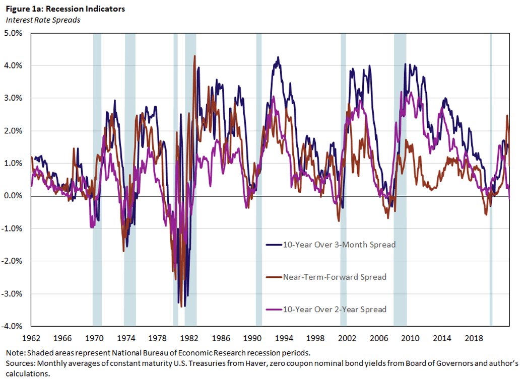
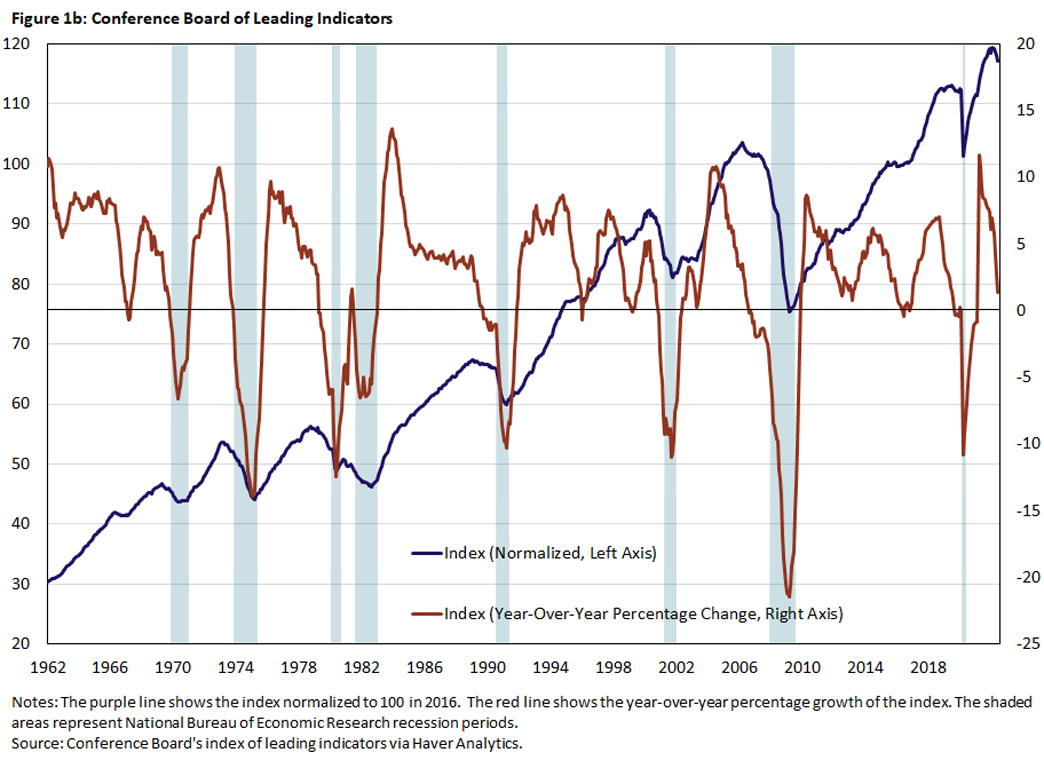
Clearly, prior to a recession, interest rate spreads become negative, and the CBLI declines. But we also occasionally have negative spreads and declining CBLIs that are not followed immediately by recessions. So, how accurate are these indicators?
Measuring the Effectiveness of Recession Indicators
To gauge these indicators' accuracy, we first have to decide critical values for the indicators that would convince us that a recession is imminent. For the interest rate spreads, the standard critical value is zero: We predict a recession if the spread is negative (or in other words, if the yield curve is inverted). Similarly, we could choose zero as a critical value for the growth rate of the CBLI. Once we decide the critical values for the available indicators, we also need a criterion that lets us rank their forecasting performance.
The choice of a critical value trades off the chance of correctly (wrongly) predicting a recession when a recession does (not) happen. To be precise, the choice trades off the true positive rate against the false positive rate. We obtain the two rates by splitting the sample in two:
- Observations when recessions occur (Sample 1)
- Observations when recessions do not occur (Sample 0)
Conditional on the critical value, the true (false) positive rate is the share of observations in Sample 1 (Sample 0) for which the indicator variable exceeds the critical value.
We can plot the true positive rate against the false positive rate as we vary the critical value. This curve is called the receiver operator characteristic (ROC) curve, and Figure 2 depicts two stylized versions of the ROC curve: lines A and B.
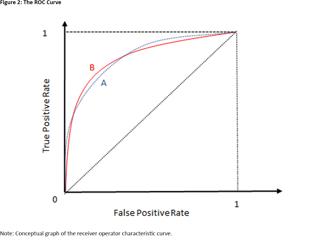
The ROC is an increasing function: As we reduce the critical value, the false and true positive rates are both increasing. This is easiest to see at the two extreme values of the ROC, when the false and true positive rates are either zero or 1.
Suppose we choose a critical value that is less than any observed value of the indicator variable. Then we would always predict a recession. That is, the true and false positive rates would both be 1. Conversely, if we choose a critical value that is larger than any observed value of the indicator variable, then we would never predict a recession, and the true and false positive rates would both be zero.
What does the ROC tell us about the informativeness of an indicator? Suppose an indicator contains no information about the possibility of a recession occurring. Then, the probability that the indicator variable exceeds its critical value does not depend on whether a recession occurs, and the true and false positive rates are the same for any critical value. Therefore, the ROC of an uninformative indicator is the dotted diagonal in Figure 2. In other words, if the ROC of an indicator is above the diagonal, it is informative about recessions. The best indicator would have an ROC that is very steep at the origin: A true positive rate that is 1 is possible with a very small false positive rate.
Comparing Indicators
Can we use the ROC to compare the informativeness of two indicators? Yes and no. Suppose that the ROC of indicator A is uniformly above the ROC of indicator B. That is, for any false positive rate we are willing to accept, A delivers a higher true positive rate than B. Then, indicator A is clearly preferred.
But what if the ROCs of the two indicators intersect as in Figure 2? Then, A yields a higher true positive rate than B for both low and high false positive rates, but B yields a higher true positive rate than A for intermediate false positive rates.
One resolution of this ambiguity is to ask which indicator is better on average. For this purpose, we consider the area under the ROC curve (AUROC), or the integral of the ROC from zero to 1. Since the ROC is bounded below by the ROC of an uninformative indicator (the dotted diagonal) and bounded above by the ideal ROC (a step function at the origin), AUROC takes on values between 0.5 and 1.
The use of the ROC curve and the AUROC is well-established in medical research for the comparison of diagnostic tests and in machine learning for the comparison of classification algorithms.2
Assessing the 10Y3M Spread
We now evaluate the performance of the 10Y3M Treasury spread as an indicator of future recessions using the AUROC framework. In particular, we ask if adding either of the two alternative spreads — the NTF spread or the 10Y2Y Treasury spread — or the growth rate of the CBLI improves the forecast performance.3
Since we want to know if adding alternative indicators to the baseline 10Y3M Treasury spread improves forecasts, we first need a method to aggregate the information contained in a set of indicators. We do this by running probit regressions using the indicator variables as regressors. In this regression, the dependent variable takes on the values zero or 1. For example, if we want to predict recessions at the one-year horizon, the dependent variable takes the value 1 if there is a recession within the next year, and zero otherwise. The probit regression then estimates the probability that a recession will occur within the next year, conditional on the current indicator values. Using the probit framework, we can say whether adding an indicator improves our ability to forecast recessions in a statistically significant way.
Our baseline regression model uses the 10Y3M Treasury spread’s current value and six-month lagged value as predictors.4 The competing models add one of the other three indicators to the baseline model. For our analysis, we use monthly data from January 1962 to December 2017. We end the sample in 2017 since we do not expect that any indicator could have predicted the COVID-induced 2020 two-month recession. We exclude months for which the economy is already in a recession.5 We calculate the ROC curve and AUROC for the estimated probit models, and we obtain statistics for (AU)ROC from 1,000 block-bootstrapped samples. That is, we generate artificial samples by randomly selecting contiguous blocks from our observed sample.
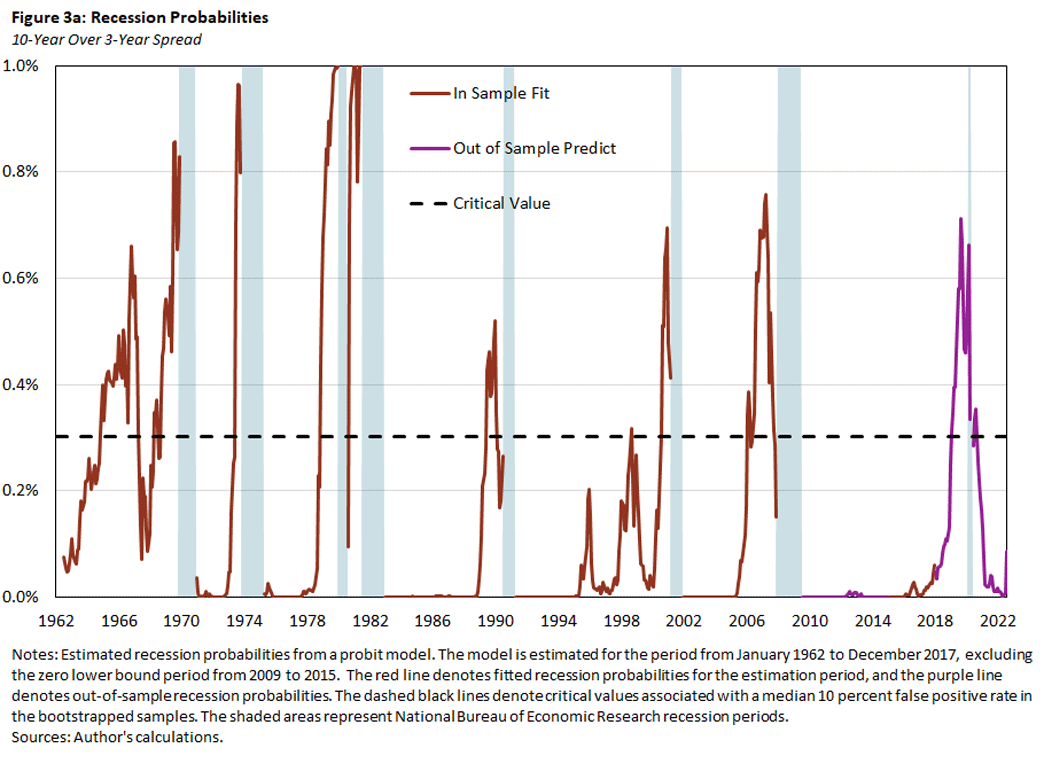
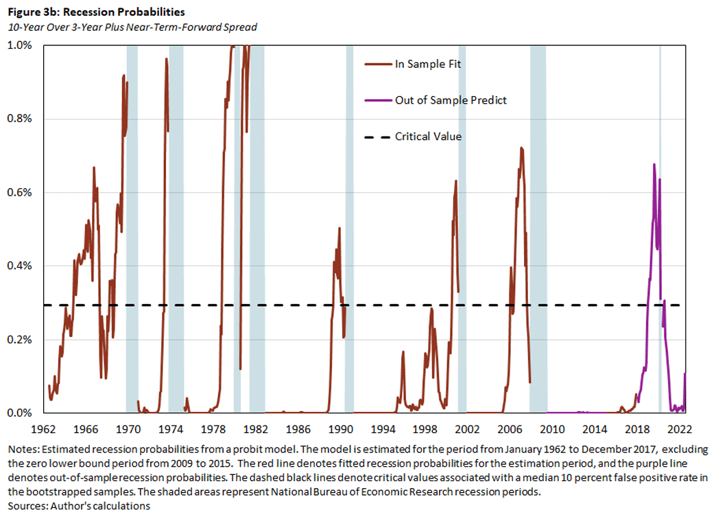
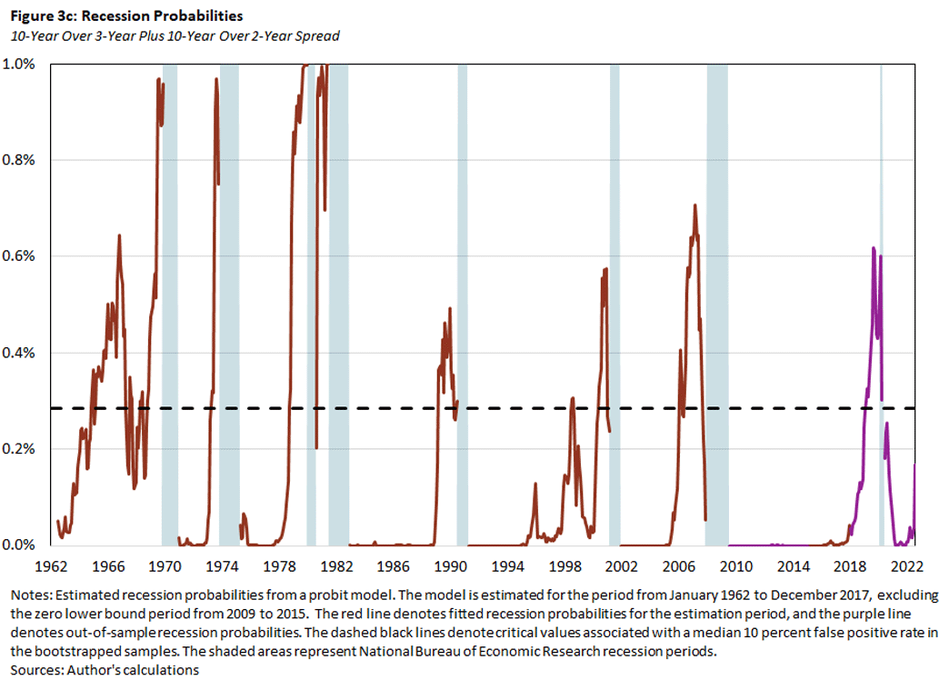
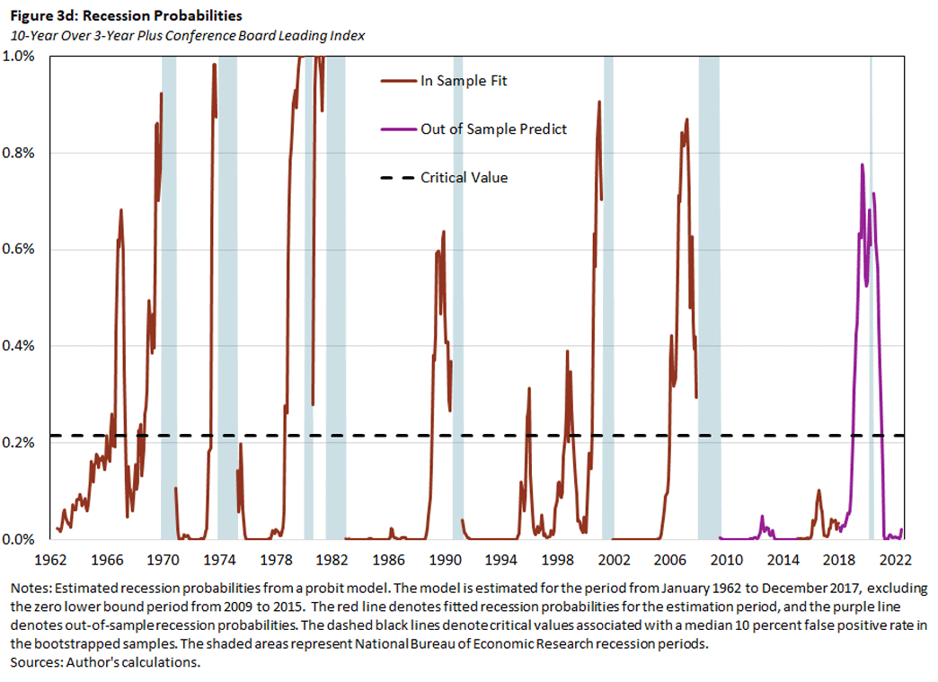
In Figure 3, we plot the probabilities for a recession within the next year implied by the probit regressions using the baseline model with the 10Y3M spread alone (Figure 3a) or together with one of the alternative predictors: the NTF spread (Figure 3b), the 10Y2Y spread (Figure 3c) or the CBLI (Figure 3d). The red lines denote the in-sample fitted recession probabilities, and the purple lines denote the out-of-sample predicted recession probabilities for the excluded zero lower bound and post-2017 period. The dashed black lines denote the critical values that are consistent with a false positive rate of 10 percent, based on the bootstrapped samples.
We make three observations:
- The recession probabilities increase prior to a recession, but again there are episodes when the probabilities increase without being followed by a recession. In particular, the probabilities in these episodes exceed the critical values for predicting a recession.
- The predicted recession probabilities are quite similar across models. In other words, adding one of the additional indicators to the baseline model does not much affect the prediction outcome.
- In 2019, all of the indicators predicted a recession to start sometime over the next 12 months. If one believes in the forecasting ability of these indicators, this suggests that a recession might have happened even in the absence of the pandemic.
In Table 1, we compare the prediction performance of the four models based on the AUROC criterion.
Table 1. Indicator Performance
| Row | 5% | Median | 95% |
| 10Y3M Spread | 0.89 | 0.94 | 0.98 |
| 10Y3M Spread + NTF Spread | 0.89 | 0.95 | 0.99 |
| 10Y3M Spread + 10Y2Y Spread | 0.90 | 0.95 | 0.99 |
| 10Y3M Spread + Conf Board Leading Index | 0.91 | 0.96 | 0.99 |
| Note: The table lists the median, fifth percentile and 95th percentile AUROC values of the estimated probit models from 1,000 bootstrapped samples. The first row lists the values from the baseline model with the 10Y3M spread, current and six-month lagged. The remaining rows add the specified additional predictor to the baseline model. | |||
The median AUROC values are quite large for all of the models, ranging from 0.94 to 0.96 and almost reaching the theoretical upper bound of 1. Adding one of the three alternative indicators to the baseline model increases the models' AUROC values, but they stay well within the range of sampling uncertainty defined by the fifth and 95th percentile range of the baseline model.
The AUROC value measures a model's average performance for trading off true positives against false positives. In Figure 4, we plot our models' ROCs to get a better idea on how they perform over the range of possible false positives. The baseline model is represented by the solid purple line and the shaded pink areas. Conditional on the false positives on the horizontal axis, the purple line denotes the median true positives, and the pink areas represent the 68 percent and 90 percent coverage areas for true positives. The light blue, red and dark blue lines denote the median ROCs of the alternative models with the NTF spread, the 10Y2Y spread and the CBLI, respectively.
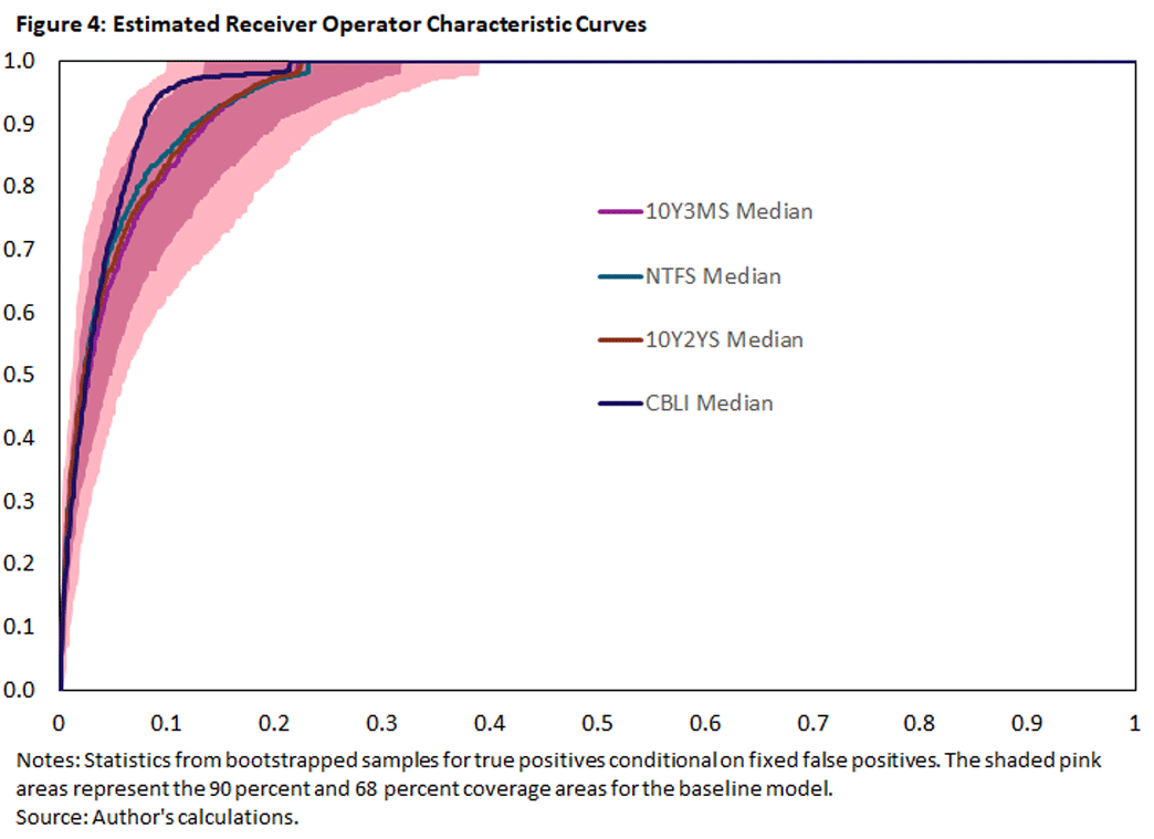
As we can see, the improvements from including alternative spreads are uniform across the range of false positives but are marginal at best and well within the sampling uncertainty. Including the CBLI does yield a more noticeable improvement, but the median improvement is well within the sampling uncertainty even for this indicator.
Conclusion
We have argued that the 10Y3M bond spread is a pretty good predictor (based on the AUROC criterion) for the onset of a recession within a year and that including three alternative indicators does not significantly improve the prediction performance.
So, what are the readings as of July for the likelihood of a recession? Looking at the 10Y3M bond spread alone does not suggest a substantial risk of recession for the next year: The bond spread has not changed much over the last year (as seen in Figure 1a), and even though the recession probability from its probit-model increased somewhat in July, it is still well below a reasonable critical value for a recession (as seen in Figure 3a).
Nevertheless, the two alternative spreads have both declined recently, and the 10Y2Y spread is slightly negative as of July. Including these spreads into the baseline model does increase the probabilities for a recession, but for now they stay below their critical values (as seen in Figures 3b and 3c).6
Andreas Hornstein is a senior advisor in the Research Department at the Federal Reserve Bank of Richmond.
1
For example, see the 2014 paper "Viewpoint: Boosting Recessions," the 2013 paper "Facts and Challenges From the Great Recession for Forecasting and Macroeconomic Modeling" and the 2014 report "What Predicts U.S. Recessions?"
2
For an early application to economics, see the 2011 paper "Evaluating the Classification of Economic Activity Into Recessions and Expansions."
3
Our approach follows the work in the 2014 article "What Predicts U.S. Recessions?"
4
Adding the lagged 10Y3M spread does improve the forecast performance, especially at shorter horizons.
5
We also exclude the period from January 2009 to December 2015 when the fed funds rate was at its effective lower bound. During this time, the movements of short-term rates were constrained, which is likely to constrain movements of the NTF spread.
6
We do not yet have the July CBLI to evaluate its impact on the recession probability.
To cite this Economic Brief, please use the following format: Hornstein, Andreas. (August 2022) "Recession Predictors: An Evaluation." Federal Reserve Bank of Richmond Economic Brief, No. 22-30.
This article may be photocopied or reprinted in its entirety. Please credit the author, source, and the Federal Reserve Bank of Richmond and include the italicized statement below.
Views expressed in this article are those of the author and not necessarily those of the Federal Reserve Bank of Richmond or the Federal Reserve System.
Subscribe to Economic Brief
Receive a notification when Economic Brief is posted online.
Contact Us