Unemployment Changes as Recession Indicators
After the rapid recovery from the COVID-induced 2020 recession, U.S. economic activity has slowed in 2022, but labor markets have remained strong, and the unemployment rate is at historically low levels. This Economic Brief reviews the evidence on changes in unemployment as a coincident indicator for the start of recessions. I find that changes in unemployment are good indicators of recessions, in particular when combined with lagged term spreads, which are good recession predictors at the one-year horizon but not reliable at short horizons.
The past year has seen the Federal Open Market Committee tightening policy in response to seemingly persistent high inflation. These policy moves have some people concerned that a recession is imminent. Last year, I examined indicators that have proven useful in predicting recessions. In this article, I follow up that analysis by examining labor market variables as coincident recession indicators.
Labor Market Indicators
In particular, I review the performance of two labor market variables — year-over-year changes in initial unemployment insurance (UI) claims and the unemployment rate — as coincident indicators for the start of recessions. Having coincident indicators is useful because the beginning and end of recessions are determined by considering the overall behavior of the economy, and this determination takes time.1 Thus, the start of a recession may not be immediately apparent. We confirm that the two unemployment-based indicators perform very well in detecting whether the economy is in a recession or will be in a few months.
Given the success of term spreads in predicting recessions at the one-year horizon (as noted in my August article), I also add a lagged term spread to the unemployment indicators and find that this spread improves the indicator performance significantly. Finally, adding a portmanteau index of other coincident indicators does not improve the indicator performance.
Overall, the current signals from these recession indicators are mixed. While the unemployment rate has remained at historically low levels for some time now, recently initial UI claims have been increasing and, as of March, their increase is consistent with a raised likelihood of an imminent recession.
Setting Up the Analysis
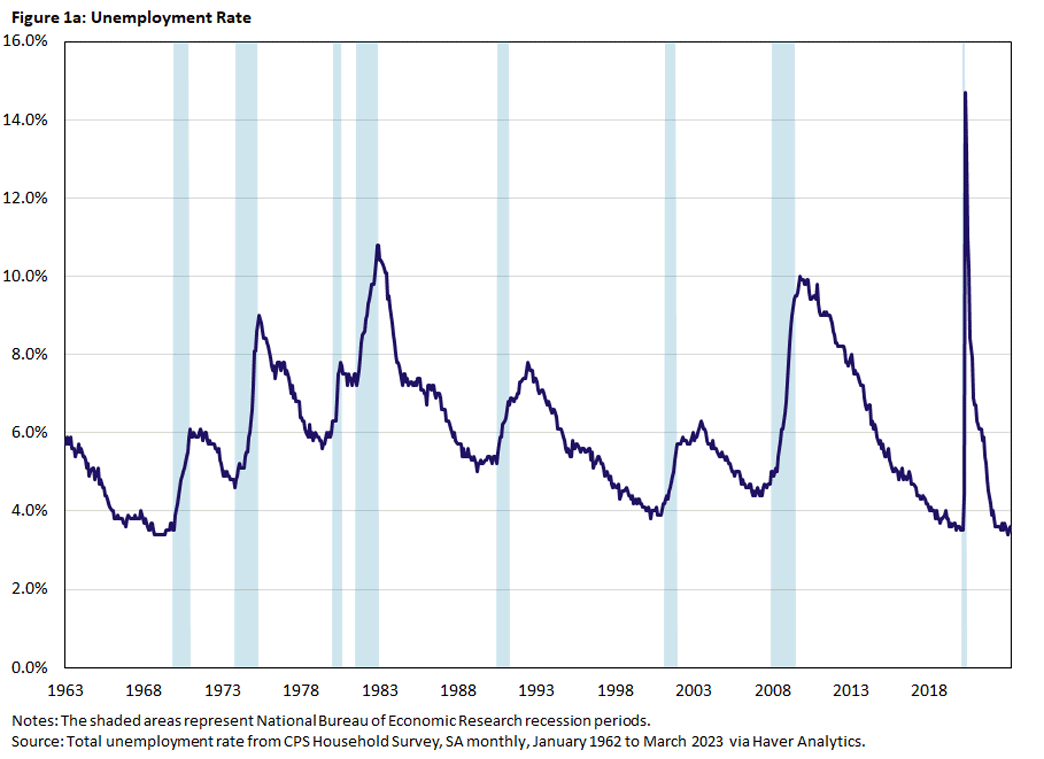
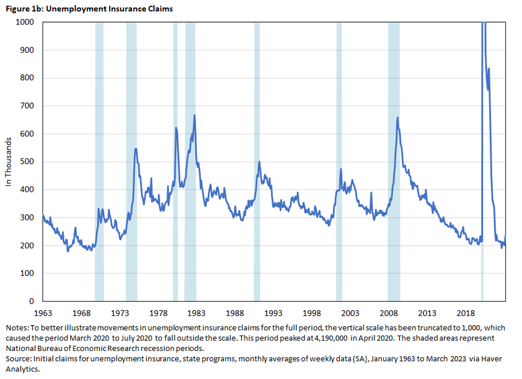
For the baseline indicators, I use the unemployment rate and the initial claims in regular state UI programs. The rapid increase of the unemployment rate has frequently been mentioned as a good indicator for the start of recessions.2 Initial claims to state UI programs display a similar dynamic at the beginning of a recession, but they tend to be less persistent as the recession proceeds, and they are a bit more timely since they are available weekly.
Figures 1a and 1b below plot monthly data for the unemployment rate and initial UI claims for the period January 1963 to March 2023. The shaded areas represent recessions as defined by the National Bureau of Economic Research (NBER) Business Cycle Dating Committee.
As noted, the unemployment rate increases rapidly at the start of a recession, then declines only gradually from its peak around the recession's end. In Figure 1b above, we can see that initial UI claims also spike at the beginning of the recession, but unlike the unemployment rate they tend to decline faster thereafter.
Regarding the indicators we'll examine, we define the unemployment rate indicator as the year-over-year change of the unemployment rate since the unemployment rate has already been normalized relative to the labor force. We define the initial UI claims indicator as the year-over-year growth rate of UI claims since they are in levels.3 We will show that both indicators perform well as predictors of recession starts. But can we do better? For this purpose, we consider two alternative variables.
Interest Rate Term Spreads
As previously noted, interest rate term spreads are good recession predictors at the one-year horizon, even though they do not perform well as short-horizon predictors. We therefore consider adding a lagged term spread as an additional indicator.
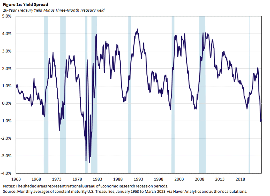
In particular, we use the six-month lag of the 10-year Treasury bond rate over the three-month Treasury bill rate, which we'll call 10Y3M. The 10Y3M spread tends to negative (that is, the yield curve is inverted) about a year before a recession starts, as seen in Figure 1c below. We use the spread itself as an indicator.
Index of Coincident Indicators
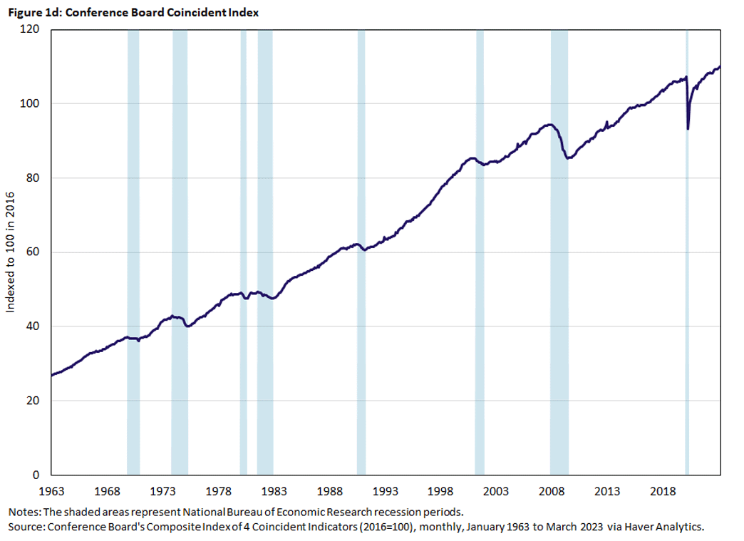
Finally, rather than adding several other alternative series, we consider the Conference Board's index of coincident indicators (CBCI).4 Overall, the CBCI has been trending up, but it declines in recessions, as seen in Figure 1d below. We use the year-over-year growth rate of the CBCI as an indicator.
Measuring the Effectiveness of Recession Indicators
To gauge these indicators' effectiveness, we first must decide on critical values for the indicators that would convince us that we are in a recession or that a recession is imminent. For the unemployment rate, it has been argued that a short-term increase that exceeds between 0.35 and 0.50 percentage points indicates a recession.5 For interest rate spreads, the standard critical value is zero: A negative spread predicts a recession. Similarly, we could choose zero as a critical value for the growth rate of the CBCI. Once we decide the critical values for the available indicators, we also need a criterion that lets us rank their forecasting performance.
My August article discusses two concepts to evaluate the effectiveness of an indicator variable and how it relates to the choice of critical values:
- The receiver operator characteristic (ROC) curve
- The area under the ROC curve (AUROC)
The choice of a critical value for a recession indicator trades off the chance of correctly predicting when a recession occurs (the true positive rate) against the chance of wrongly predicting a recession when a recession does not occur (the false positive rate). Both rates are between zero and 1, and as we reduce the critical value for an indicator, we will more frequently predict that a recession is imminent. That is, we will increase both the rate of true positives and the rate of false positives.
In the limit, if the critical value is less than any observed value for the indicator, we will always predict a recession, and the true and false positive rates will both be 1. Similarly, if we increase the critical value, we will predict recessions less frequently, and eventually we will never predict a recession and the true and false positive rates will both be zero.
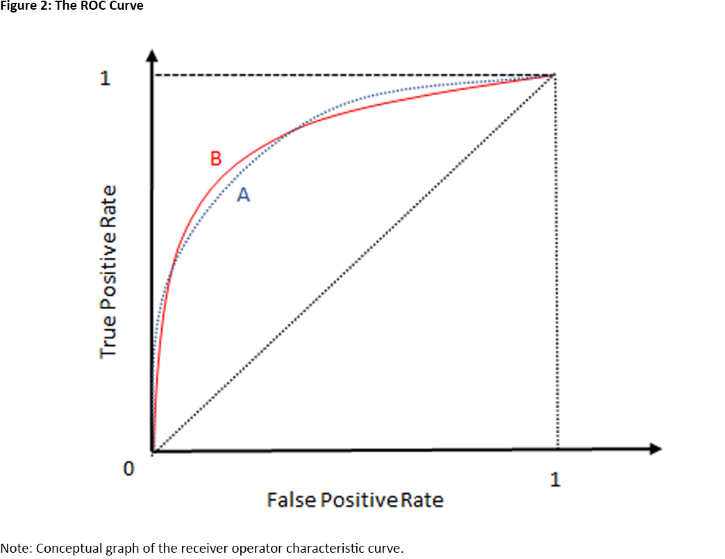
The ROC curve plots the true positive rate against the false positive rate as we vary the critical value. As we just discussed the ROC is an increasing function, seen in Figure 2 below.
What does the ROC tell us about the informativeness of an indicator?6 Suppose an indicator contains no information about the possibility of a recession occurring. Then, the probability that the indicator variable exceeds its critical value does not depend on whether a recession occurs, and the true and false positive rates are the same for any critical value. Therefore, the ROC of an uninformative indicator is the dotted diagonal in Figure 2 above. In other words, if the ROC of an indicator is above the diagonal, it is informative about recessions. The best indicator would have an ROC that is very steep at the origin: A true positive rate that is 1 is possible with a very small false positive rate.
Can we use the ROC to compare the informativeness of two indicators? Yes and no. Suppose that the ROC of indicator A is uniformly above the ROC of indicator B. That is, for any false positive rate we are willing to accept, A delivers a higher true positive rate than B. Then, indicator A is clearly preferred.
But what if the ROCs of the two indicators intersect as in Figure 2? Then, A yields a higher true positive rate than B for both low and high false positive rates, but B yields a higher true positive rate than A for intermediate false positive rates.
One resolution of this ambiguity is to ask which indicator is better on average. For this purpose, we consider the area under the ROC curve (AUROC), or the integral of the ROC from zero to 1. Since the ROC is bounded below by the ROC of an uninformative indicator (the dotted diagonal) and bounded above by the ideal ROC (a step function at the origin), AUROC takes on values between 0.5 and 1.
The use of the ROC curve and the AUROC is well-established in medical research for the comparison of diagnostic tests and in machine learning for the comparison of classification algorithms.7
Assessing the Unemployment Indicators
We now evaluate the performance of unemployment changes as coincident indicators of recession starts using the AUROC framework. In particular, we ask if either indicator is preferable or if adding either of the two alternative indicators — the 10Y3M Treasury spread or the growth rate of the CBCI — improves predictive performance.
Since we want to know if adding an alternative indicator to the baseline unemployment indicators improves forecasts, we first need a method to aggregate the information contained in a set of indicators. We do this by running probit regressions using the indicator variables as regressors. In this regression, the dependent variable takes on the values zero or 1. For example, if we want to know if the indicator is coincident with recessions, the dependent variable takes the value 1 if the economy is in a recession, and zero otherwise. The probit regression then estimates the probability that the economy is in a recession, conditional on the current indicator values. Using the probit framework, we can say whether adding an indicator improves our ability to forecast recessions in a statistically significant way.
Our baseline regression models use either the year-over-year change in the unemployment rate or the year-over-year growth rate of initial UI claims as indicators. The competing models add one of the other two indicators to the baseline model. For our analysis, we use monthly data from January 1963 to December 2018. We end the sample in 2018 since we do not expect that any indicator could have predicted the COVID-induced two-month recession in 2020.
We are interested in how well the indicators predict the start of a recession, and this determines the choice of prediction outcomes and the sample period. Our prediction outcome is whether or not the economy is in a recession in the current month.
Regarding the sample period, we start with the months when the economy is not in a recession and the first six months of recessions. Again, we want to predict the start of a recession, and enough other information should have accumulated after six months to determine that the economy is in a recession.
Finally, we exclude the first year of business cycle expansions from the sample. We do this because of the aforementioned dynamic pattern of unemployment in a recession: Unemployment increases sharply at the beginning of a recession, peaks late in the recession (or maybe even in the early recovery period), then declines gradually. This means that, in the early expansion phase of the business cycle when the economy is by definition not in a recession, unemployment changes are still positive and large, what we take to be a sign for the start of a recession. But at that stage, we are no longer concerned with a recession starting, so excluding these months seems like a reasonable restriction.8
We calculate the ROC and AUROC for the estimated probit models, and we obtain statistics for (AU)ROC from 1,000 block-bootstrapped samples. That is, we generate artificial samples by randomly selecting contiguous blocks from our observed sample.
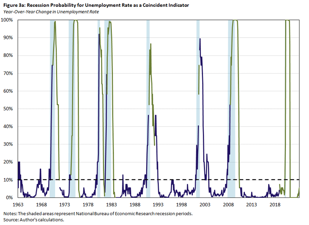
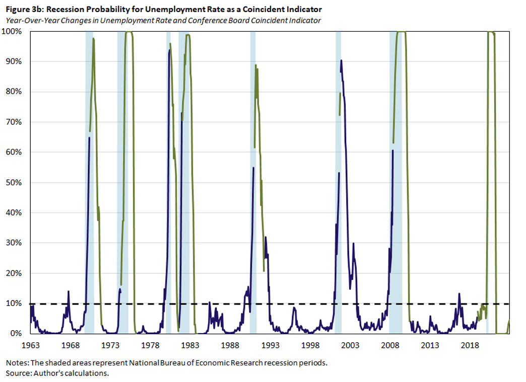
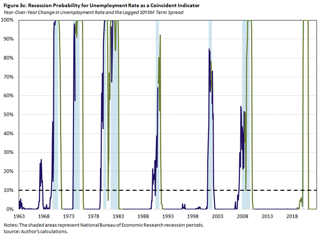
In Figure 3 below, we plot the estimated probability that the economy is currently in a recession using the baseline model with the year-over-year change of the unemployment rate alone (Figure 3a) or together with one of the alternative predictors: the CBCI (Figure 3b) or the six-month lagged 10Y3M spread (Figure 3c). The blue lines denote the in-sample fitted recession probabilities, and the green lines denote the out-of-sample predicted recession probabilities for months that are more than six months past the start of a recession, are in the first year of an expansion phase, or belong to the post-2018 period. The dashed black lines denote the critical values that are consistent with a false positive rate of 10 percent, based on the bootstrapped samples.
We make two observations. First, the recession probabilities for the unemployment rate indicator increase with the start of a recession. However, there are some episodes when the probabilities increase without being followed by a recession. In particular, the probabilities in these episodes exceed the critical values for predicting the start of a recession. This is consistent with the critical value being chosen to be consistent with a false positive rate of 10 percent.
The second observation is that the predicted recession probabilities are quite similar across models. In other words, adding one of the additional indicators to the baseline model does not much affect the prediction outcome. But note that the model with the lagged 10Y3M Treasury spread has several episodes when the coincident recession probability exceeds the critical value before the recession starts.
In Table 1 below, we list critical values for changes in the unemployment rate and initial UI claims that generate particular false positive rates. For example, if we predict the start of a recession whenever the unemployment rate increases by more than 0.4 percentage points, we expect a false positive rate of only 5 percent. This corresponds to a predicted recession probability of 0.2 from our probit model with changes in the unemployment rate as the only prediction variable. If we also include the lagged term spread in the probit model, then the critical value for the predicted recession probability for a false positive rate of 5 percent is roughly the same.
| Table 1: Critical Values for Unemployment Indicators | ||||||||
|---|---|---|---|---|---|---|---|---|
| False Positive Rate | Indicator Variable | Probit Probabilities | ||||||
| UR | UIC | UR | UIC | |||||
| Alone | With CBCI | With Lagged 10Y3M | Alone | With CBCI | With Lagged 10Y3M | |||
| 0.01 | 1.30 | 24.70 | 0.70 | 0.70 | 0.55 | 0.55 | 0.54 | 0.61 |
| 0.05 | 0.40 | 13.50 | 0.20 | 0.19 | 0.19 | 0.21 | 0.19 | 0.20 |
| 0.10 | 0.20 | 7.40 | 0.11 | 0.11 | 0.04 | 0.09 | 0.09 | 0.08 |
| March 2023 | -0.10 | 9.66 | 0.06 | 0.08 | 0.03 | 0.13 | 0.14 | 0.14 |
|
Note: The first three rows display the critical values of recession indicators consistent with the false positive rates listed in the first column. The recession indicators are the year-over-year increases in the unemployment rate (expressed in percentage points) and initial UI claims (expressed in percent growth rate), and the probabilities for the probit models are with the unemployment rate and UI claims, alone and with additional indicators. The last row displays the actual values of the recession indicators in March 2023. |
||||||||
Table 2 below provides additional information on the relative prediction performance of the coincident indicator models based on the AUROC criterion.
| Table 2: Performance of Coincident Predictors | ||||
|---|---|---|---|---|
| Row | 5% | Median | 95% | Relative Performance |
| UR | 0.90 | 0.94 | 0.97 | |
| UR + CBCI | 0.90 | 0.94 | 0.97 | 0.54 |
| UR + Lagged 10Y3M | 0.98 | 0.99 | 1.00 | 0.00 |
| UIC | 0.91 | 0.95 | 0.98 | |
| UIC + CBCI | 0.92 | 0.95 | 0.98 | 0.14 |
| UIC + Lagged 10Y3M | 0.96 | 0.97 | 0.99 | 0.02 |
| CBCI | 0.84 | 0.90 | 0.95 | |
| Lagged 10Y3M | 0.84 | 0.92 | 0.97 | |
|
Note: The outcome variable is whether the economy is in a recession in the current month. The table lists the median, fifth percentile and 95th percentile AUROC values of the estimated probit models from 1,000 boot-strapped samples. The first three rows list the values from the baseline unemployment rate model alone and together with the specified additional indicators. The next three rows represent the same for the baseline initial UI claims model. Finally, the last two lines list the values from the additional indicators alone, the CBCI and the lagged 10Y3M US treasury spread. The last column denotes the fraction of simulated samples for which the augmented baseline model has a lower AUROC value than the baseline model alone. |
||||
The median AUROC values are quite large for all the models, ranging from 0.90 to 0.99 and almost reaching the theoretical upper bound of 1. There is no significant difference between the two unemployment baseline models: Their median AUROC values are well within each other's range of sampling uncertainty defined by the fifth and 95th percentile range.
Adding the lagged 10Y3M Treasury spread significantly improves performance relative to either baseline model: The augmented model's median is outside the baseline model's sampling range. Furthermore, for all the random samples drawn, the fraction of samples where the augmented model's AUROC is less than the baseline model's AUROC is 0 percent for the unemployment rate indicator and only 2 percent for the initial UI claims indicator, as shown in the last column of Table 1 above. Finally, adding the CBCI indicator does not improve performance.
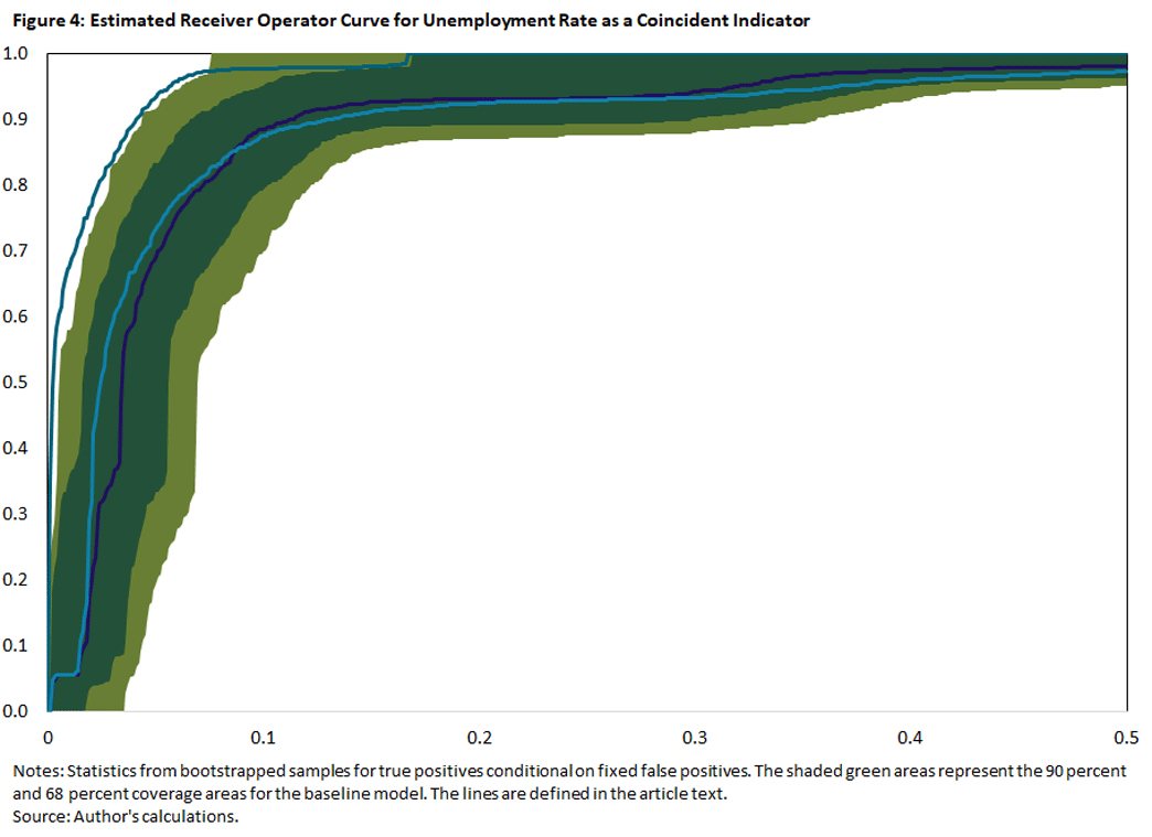
In Figure 4 below, we plot the ROCs for the models with the unemployment rate as a coincident predictor to get a better idea on how they perform over the range of possible false positives. The baseline model is represented by the purple line and the shaded green areas. Conditional on the false positives on the horizontal axis, the purple line denotes the median true positives, and the green areas represent the 64 percent (dark green) and 90 percent (olive plus dark green) coverage areas for true positives. The light blue and teal lines denote the median ROCs of the alternative models that also include the CBCI and 10Y3M spread, respectively.
As we can see, including the 10Y3M spread uniformly improves the performance relative to the baseline, especially if we are willing to accept false positives more than 5 percent of the time. On the other hand, including the CBCI leads to only marginal improvements for false positive rates below 10 percent and worse outcomes for false positive rates above 10 percent. The pattern for the ROCs of the initial UI claims indicator are very similar.
Conclusion
We have argued that the year-over-year change in the unemployment rate or initial UI claims is a pretty good predictor (based on the AUROC criterion) for the start of a recession in the U.S. economy. We have also argued that including the six-month-lagged 10Y3M Treasury spread significantly improves the performance.
Conditional on the current unemployment readings, one can argue that a recession might well be imminent. In the last row of Table 1 above, we display the latest readings from March for our recession indicators. While the unemployment rate remains at record low levels, the recession probability from the probit model that incorporates information on the unemployment rate and lagged term spreads is now close to a critical value consistent with a 10 percent false positive rate. Furthermore, initial UI claims have increased recently, and this increase as well as the recession probabilities from the probit models with UI claims now exceed the critical values consistent with a 10 percent false positive rate.
Andreas Hornstein is a senior advisor in the Research Department at the Federal Reserve Bank of Richmond.
The NBER Business Cycle Dating Committee determines the beginnings and ends of U.S. recessions by considering a range of monthly measures of aggregate real economic activity, among them nonfarm payroll employment and industrial production. The announcement of a business cycle turning point usually occurs well after the turning point. For example, the committee placed the beginning of the Great Recession in December 2007 in an announcement one year later, in December 2008.
For example, former Fed Chair Ben Bernanke (at the March 2007 FOMC meeting) and former Boston Fed President Eric Rosengren (at the December 2007 FOMC meeting) note that every increase of the unemployment rate by a half percentage point or more was followed by a recession. The 2012 paper "Another Look at Our Unemployment/Recession Rule of Thumb (PDF)" argues that if the three-month moving average of the unemployment rate increases by more than 0.35 percentage points relative to its minimum in the previous year, the economy is in a recession. More recently, the 2019 article "Direct Stimulus Payments to Individuals" argues that the critical value of the unemployment rate increase is 0.5 percentage points.
For my analysis, I construct the unemployment indicators from currently available seasonally adjusted data. These are not necessarily the same data that would be available in real-time when we would want to use them as recession indicators, as the data may get revised after initial release and filtering out seasonality can cause further divergence between currently available data and the data observed in real time. The March revisions of the seasonally adjusted factors for initial UI claims provide an up-to-date example. Using year-over-year changes essentially eliminates any differences between real-time and currently available seasonally adjusted data. In other words, the year-over-year changes of (non)seasonally adjusted data are essentially the same, especially when the unemployment rate or UI claims increase.
I use the year-over-year change rather than the change relative to the minimum value in the previous year since both transformations essentially yield the same result for increases in the indicator variable. Besides being easier to calculate, using the year-over-year change also reduces concerns related to possible distortions arising from seasonal adjustment procedures, as just discussed.
This index combines information from non-farm payroll employment, real personal income less transfer payments, industrial production index, and real manufacturing and trade sales. The first three series are also used by the NBER Business Cycle Dating Committee.
As sourced in footnote 2.
The rest of this section comes from my aforementioned August article "Recession Predictors: An Evaluation."
For an early application to economics, see the 2011 paper "Evaluating the Classification of Economic Activity Into Recessions and Expansions."
Note that this restriction eliminates the expansion phase prior to the 1981-82 recession from our sample since it lasted only one year. One can make an argument that the 1980 and 1981-82 recessions — combined with the intervening one-year expansion — actually represent one long recession.
To cite this Economic Brief, please use the following format: Hornstein, Andreas. (April 2023) "Unemployment Changes as Recession Indicators." Federal Reserve Bank of Richmond Economic Brief, No. 23-13.
This article may be photocopied or reprinted in its entirety. Please credit the authors, source, and the Federal Reserve Bank of Richmond and include the italicized statement below.
Views expressed in this article are those of the authors and not necessarily those of the Federal Reserve Bank of Richmond or the Federal Reserve System.
Receive a notification when Economic Brief is posted online.


