Visualizing the Breadth of Job Gains
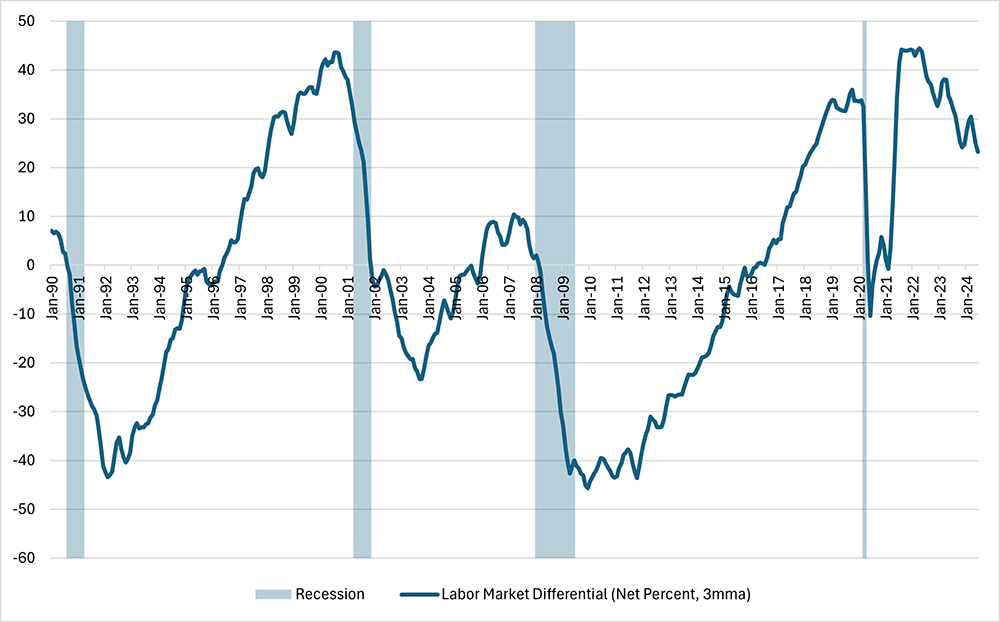
According to the Bureau of Labor Statistics, nonfarm payroll employment increased by a comparatively strong 206,000 in June following the prior month's gain of 218,000 jobs. Nevertheless, sentiment about the labor market appears to be softening: According to the Conference Board's Consumer Confidence Survey, the net percentage of consumers viewing jobs as plentiful declined to 23.2 percent in June, which — apart from the pandemic period — was the lowest since March 2018. (See Figure 1 below.)
Steady overall jobs growth combined with moderating labor market sentiment could reflect that the labor market is becoming less tight than it was a couple years ago, with loosening more evident in some industries than others. In this week's post, we explore some ways of visualizing the breadth of recent jobs growth across industries.
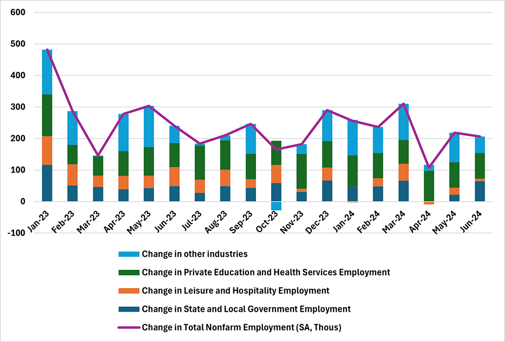
One simple way to examine the breadth of nonfarm payroll growth across industries is to break out the contribution of selected industries to total monthly job gains. Figure 2 below shows that about 75 percent of June's nonfarm payroll growth was accounted for by employment growth in three industries:
- State and local government
- Leisure and hospitality
- Private education and health
This represented an increase from 57.3 percent the previous month. On average, these industries — which made up 40.1 percent of payroll employment as of June 2024 — have accounted for 76.4 percent of monthly nonfarm payroll growth over the past 12 months. This implies that workers employed in the other 60 percent of payroll jobs could be experiencing weaker labor market conditions than June's headline figures suggest.
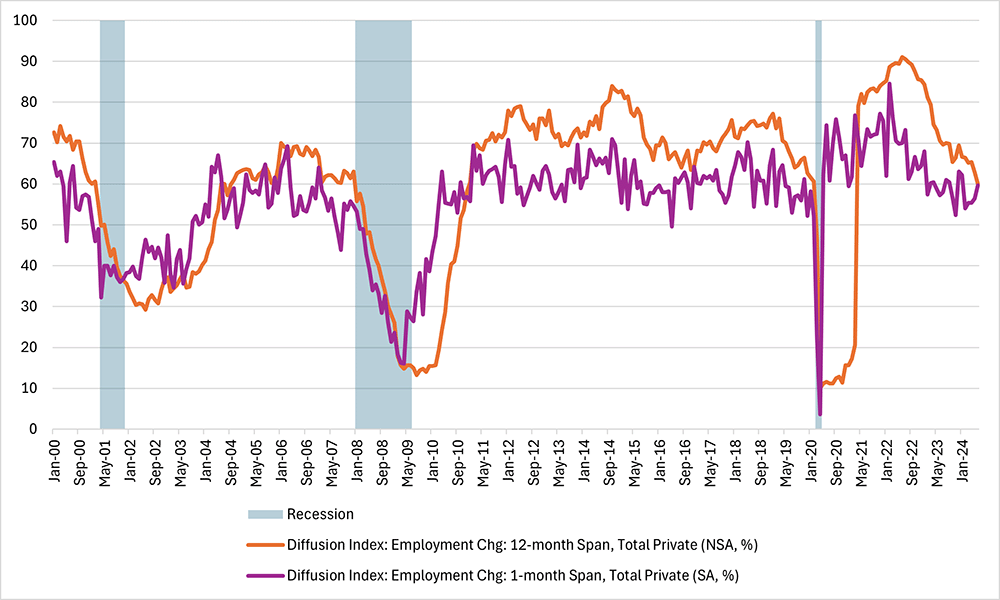
Another way to depict the breadth of job gains across industries is through a diffusion index, which in this case is a score of the dispersion of employment changes across industries over a given time span. The Bureau of Labor Statistics (BLS) calculates diffusion indexes for payroll growth by looking at industries at the four-digit North American Industry Classification System (NAICS) level, assigning each industry a score of 0 (decreased employment), 50 (employment remaining level) or 100 (increased employment), and then taking the average of these scores across all industries. A diffusion index higher than 50 indicates that more industries saw increasing employment over the time span, while an index less than 50 indicates that more industries saw decreasing employment.
Figure 3 below shows the BLS's diffusion indexes corresponding to one- and 12-month time spans. Both indexes have been trending down since 2022, indicating that payroll growth has become narrower versus two years ago. However, both diffusion indexes remain above 50, indicating that more industries than not continue to experience growth in payroll employment. Furthermore, the indexes remain above levels typically observed during recessions.
The last graphic we'll use to study the breadth of job gains is inspired by the Lorenz curve, a graph first used by economist Max O. Lorenz to show inequality in the distribution of income or wealth. The standard Lorenz curve plots the cumulative share of households from the lowest to the highest income (or wealth) on the horizontal axis against the cumulative share of income (or wealth) on the vertical axis. A 45-degree diagonal line represents perfect income equality — where the bottom X percent of income earners make up X percent of total income in the economy — while the space between the Lorenz curve and that diagonal is a visual representation of the degree of income (or wealth) inequality.
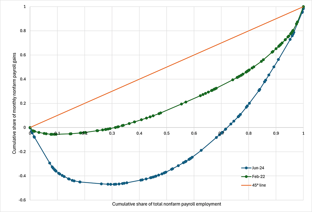
Figure 4 below shows a Lorenz-style curve depicting the dispersion in nonfarm payroll growth in June 2024. The horizontal axis represents the cumulative share of total nonfarm employment, and the vertical axis represents the cumulative share of monthly nonfarm payroll growth in June 2024. Each dot represents an industry, with industries sorted in ascending order in terms of monthly percentage changes in employment.
In contrast to the standard Lorenz curve (which is always increasing), the payroll dispersion curve can decline, with the downward sloping segment depicting the share of nonfarm payroll employment in industries experiencing declining headcount in a given month. In a month where payrolls are increasing in all industries, the blue line in Figure 4 would be monotonically increasing: It would appear as a steady upward incline. The 45-degree line represents the case of uniform growth: that is, the case where the bottom X percent of employment make up exactly X percent of nonfarm payroll growth in a given month.
In contrast to a perfectly broad-based employment report where all industries experience rising headcounts, the payroll dispersion curve in June 2024 has a downward slope from 0 to 0.3 on the horizontal axis. This is an indication that about 30 percent of nonfarm payroll jobs are in industries that are actually shrinking their headcount.
For further comparison, Figure 4 also shows the curve for February 2022, which is a month that experienced particularly broad-based job growth. The BLS's one-month diffusion index reached a record high 84.6 in that month. Nearly all of the curve for February 2022 is upward sloping, indicating about 90 percent of payroll jobs were in industries expanding their payrolls. Also, the curve is much closer to the 45-degree line. The more uneven strength of job growth in June 2024 could be one reason that sentiment on labor market conditions is weaker than recent payroll growth would suggest.
Views expressed in this article are those of the author and not necessarily those of the Federal Reserve Bank of Richmond or the Federal Reserve System.


