Visualizing the Breadth of Job Gains: A Follow-Up
In the previous post, I introduced a Lorenz-style curve of payroll growth dispersion, which plots the cumulative share of payroll employment on the horizontal axis and the cumulative adjusted payroll change1 on the vertical axis. The downward-sloping segment of the curve depicts the monthly share of employment in industries that declined over the month, while the upward-sloping segment represents the share of employment in industries that grew over the month. In today's post, I develop a new index of payroll growth dispersion based on the information from the graphic, show how it differs from the Bureau of Labor Statistics payroll diffusion index, and discuss the latest figures from July's employment report.
The BLS produces a diffusion index that measures the breadth of job gains across industries, which is similar in concept to the chart shown in last week's post. However, the payroll growth curve in some months seems to tell a different story than the BLS diffusion index.
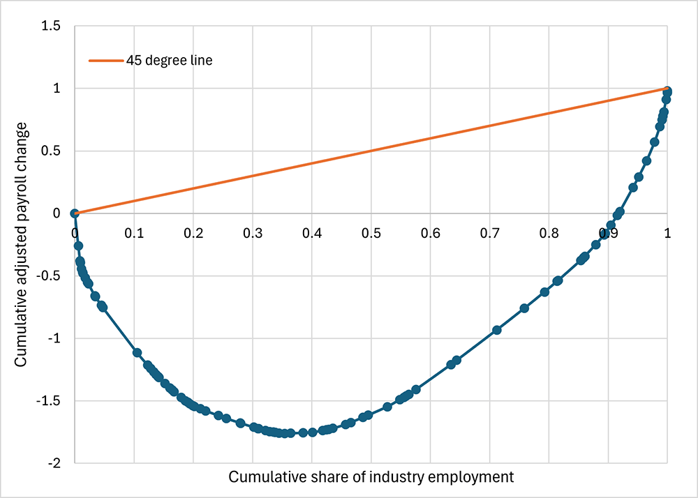
For example, in November 2004, the BLS payroll diffusion index was 49.4, falling below the 50 threshold that indicates an equal balance between industries with increasing and decreasing employment. In contrast, the payroll growth dispersion curve for November 2004 shown in Figure 1 below indicates a more optimistic picture: Only about 35 percent of nonfarm payroll employees were in industries with declining employment, compared to about 65 percent of employees in industries with rising employment. Therefore, although a larger percentage of industries saw decreasing employment, these industries employed fewer people. Most workers were in industries that expanded their payrolls on a month-over-month basis.
This example highlights that the BLS index is calculated at the industry level, essentially measuring the share of industries with rising employment. The BLS index treats industries that employ few workers the same as industries that employ many workers. It also treats an industry that adds a single job in the same way as an industry adding tens of thousands of jobs. In contrast, the payroll dispersion curve visually incorporates information on the level of employment in each industry.
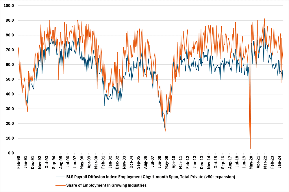
Considering the BLS diffusion index along with the share of employment in growing industries provides a more complete picture of the state of the labor market. Both indexes are plotted in Figure 2 below, and both share a common scale, with 50 indicating an equal balance between expansion and contraction. The two indexes move closely together: Between January 1991 and June 2024, the correlation between the two indexes was 0.89. Also, both indexes decline during recessions and rise during recoveries.
However, there are differences between the two indexes. In 11 of the past 12 months, the share of employment in growing industries has been higher than the BLS diffusion index. The share of employment in growing industries has also fallen by less than the diffusion index when compared to the 2010-2019 pre-pandemic decade: The current level of the rising employment share is 0.9 standard deviations below its pre-pandemic mean, compared to a relative decline of 2.2 standard deviations for the BLS index. Judging the labor market by the share of employment in growing industries would suggest that the labor market may be stronger than portrayed by the BLS diffusion index.
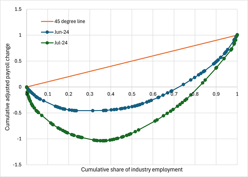
What do these data currently look like? Figure 3 below shows the payroll dispersion curve for July, with 63.3 percent of employees working in industries which added to payrolls, down from 68.6 percent the previous month. (June's nonfarm payroll growth was revised downward by 27,000 compared to the initial release.) Other than a temporary dip below 50 percent in April, this was the lowest reading since May 2020. In contrast, the BLS payroll diffusion index fell to 49.6 versus 56.0 the previous month, falling below the threshold between expansion and contraction for the first time since April 2020.
As in November 2004, the two indexes currently differ in their interpretations of July's strength: The majority of industries are reducing payrolls, yet most jobs are in industries that are adding to payrolls. However, benchmarked against their own historical values, both indexes share a view that the strength of the labor market has declined compared to what we experienced a year ago, and labor market growth currently appears to be on the weaker end of its pre-pandemic range.
The adjusted payroll change is the change in an industry's nonfarm payroll employment divided by the absolute value of the change in total nonfarm employment. In months where total nonfarm employment rose, the cumulative adjusted payroll change is equal to the cumulative share of monthly nonfarm payroll growth.
Views expressed in this article are those of the author and not necessarily those of the Federal Reserve Bank of Richmond or the Federal Reserve System.


